
The World is on Fire, Why is Fashion so Beige?

Why has fashion decided that muted and drab colors are chic? We’re in a damn pandemic, the world is literally on fire, we’re sick of our homes and our closets, and retailers say you know what I think you’ll want? Taupe! Eggplant! Heather gray! Oatmeal! Clay! Maybe we’ll get a little wild with a dusty navy or asparagus green, but we think you want clothing to look like the food that you refused to eat as a kid. Seriously, why is fashion so beige?
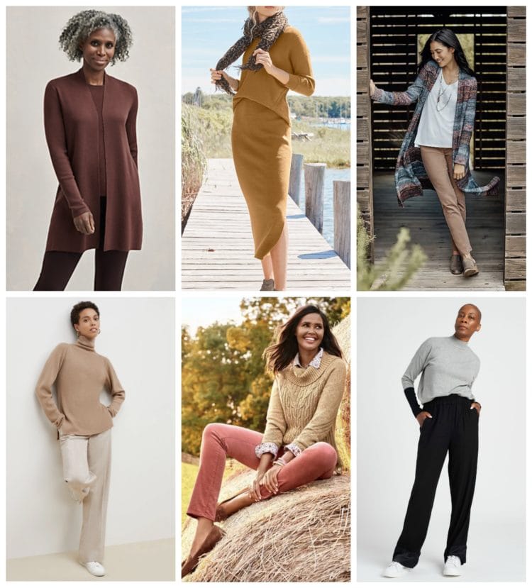
It’s even worse when you’re a “woman of a certain age.” Sure, as the flush is less prominent in our cheeks and our hair loses some of its color, many find that navy looks better with our skin than black and cream instead of snow white. But these earth tones make most of us look like we’re ready to wither up and scatter in the breeze like dried leaves in fall.
You know what else looks great with older skin and hair? Jewel tones. Where the hell are the jewel tones? Why can’t we have peacock blue instead of a dusty teal? Berry in place of eggplant? Pumpkin and goldenrod instead of rust and clay?
You may also like: The Best Clothing Retailers for Women over 40
When retailers show women in these muted neutrals, they show them in front of a dropcloth tied to a tree or in a well-lit loft, sun dappling the model’s face as she looks upward, as though she just finished a set of sun salutations. She is relaxed, she is at peace, she isn’t at a shoot with a photographer at least six feet apart, she is at a resort, a spa, a retreat.
If she isn’t outside in front of that now-cliché ‘demic dropcloth or hanging out alone in an empty apartment, she is on a dock or leaning against the wood beam of a cabin or screened-in porch, usually with a mug of tea in her hand.
Want to know where I am? I’m sitting cross-legged in a Freecycled IKEA EKTORP armchair in my bedroom because my husband is downstairs swearing as he tries to repair our refrigerator and our daughter has taken over my home office as her virtual classroom. This is not elegant, this is not a retreat, this is not vacation. And wearing a sweater the color of baby poop will not transport me to Sedona or Bali or an NYC loft.
Why is Fashion so Beige? Who decided, oh a pandemic, let's wear baby food!
When we want to ignore what is going on around us, we don’t need oatmeal cashmere joggers to do so. We already have those clothes, they're just in black and gray from last season. We have those faded sweatpants and the stretched-out sweater that has muted with washings. We don't need to pay for new versions of that packaged as “chic loungewear.”
And am I the only one who finds is more enjoyable to do yoga in my living room, jog around the block, or hop on my Peloton in some energizing color? I don't think so. And when we need to pull ourselves together for work, studies have proven that many bright colors help you look like a leader, like someone to trust, and heck, it looks a lot better during a Zoom!
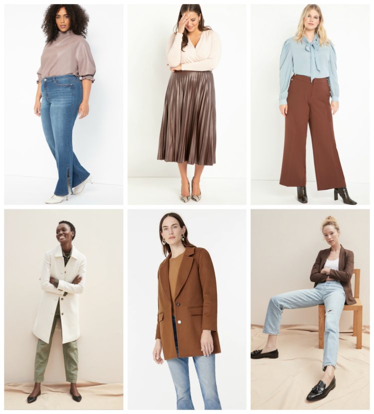
When you are a larger size, you’re even more starving for color. For years, retailers have shamed plus-sized women by offering either black or the most hideous and garish prints. Just as some retailers have recognized that women over a size 12 exist, the fashion trends change to where all sizes are now wearing the sad offerings that plus-sized women have had to deal with for decades.
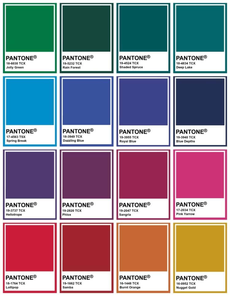
Pantone called it before the pandemic happened – we would want tranquility. Colors of the sand and sky. But along with these soft, tranquil shades Pantone suggested Rhubarb and Bayberry and Glistening Grape and Water Nymph. And hell, the Pantone Color of the Year is Classic Blue which seems to be forgotten for Cornhusk, Stucco, Peach Quartz, and Faded Jade.
You may also like: How to Wear Pantone's Color of the Year
Life may suck right now but our wardrobes don't have to reflect that. We’re not pea soup or baby poop or dried up leaves or the color of water after cleaning your brushes during an art project. We need to feel joy, have energy, be motivated to keep pushing forward.
We deserve clothes that are fun to wear, bring color to our cheeks, and make it enjoyable to get dressed, even if it’s to go from the bedroom to the kitchen table for yet another Zoom session.
Whether it’s a cocktail dress or a pair of joggers, I’d love to be able to find these kinds of colors at my favorite size-inclusive retailer. Give me a higher-end t-shirt that flatters curves, a pair of joggers, a hoodie, a tunic, knit pull-on pants, and a pair of leggings in a luxe heavyweight jersey with nice drape. Sweaters with pretty necklines that are machine washable and not transparent. A heavyweight longer cardigan with patch pockets and an optional self-belt and a matching sweater tee that doesn’t have a band at the hem.
Give me some elevated wardrobe staples that can mix or match for hanging out on the couch, heading into the office, running to Target, or just gussying up for that 500th Zoom meeting. I don’t think I am alone in hoping the future is healthier, kinder, and full of optimistic color.
Did you like what you just read?
Consider tapping here to buy me a coffee in thanks. The best gift you can give a content creator is the gift of sharing. Consider sharing this article on Facebook or Pinterest. Thank you so much for your support!

You read my mind! They wonder why the fashion industry is suffering. It is not rocket science. It is hard to spend money on fashion when the colors you look great in come out every three years. Great article.
.
Amen, amen, and amen!!! I laughed and nodded through this whole piece. Soooo good!
I couldn’t believe my eyes when I saw the Garnet Hill catalog, mentioned in the first comment. Even the bedding was dominated by shades of brown. How about a world where retailers offer clothes in a variety of flattering colors? I’d take fewer styles and more color range.
I happened to look at Pure Collection (English, they promote cashmere but I like their merino sweaters and pencil skirts), and they are promoting color, lots of color. Kettlewell works for me too.
I agree with you, however, for the exception that proves the rule, so to speak, I found a beautiful teal moto jacket, shirt and sweater at Chicos. This is a great color for me, a redhead so I’m happy, happy!
amen!
Gosh yes — just flipped through the latest Garnet Hill catalog today and everything looked so dusty and tentative that I wondered if the printer made a mistake. Dull colors, same old shapes and styles, making even their lovely young models look dull and subdued.
If I ran the world, there would be clothing in all colors from vibrant to muted in all seasons and through all trend cycles. Alas, it is not to be. While I sit and wait for my obnoxious brights to come back, I’ll just go watch Trinny Woodall’s feed on Instagram for color inspiration. Totally different body type from me and a different aesthetic, style wise, but I do love her approach to and enthusiasm for COLOR of all kinds.
Frustrated, just went to kettlewell.com, took color quiz, found out i am a winter and amazingly, i loved all the colors and already wear most. Hair is white/silver, dark coloring and get compliments all the time. Now i would just like to go down a size healthwize. Love your blog Allison, keep on keepin on!
Here’s the thing: whether you can wear these colors or not, most of them will not stay in style. Those pale muddy pinks and greens? Nope. Why? Very few people love them and they don’t coordinate well with other basics. Muddy colors are fine as accents, but do they work well with basics many of us have? Not really. They make me nauseous.
I like a lot of browns, but they also go out of style. So, knowing that, I won’t buy. We’re not going anywhere where we need to be up to date. So, wearing navy and color isn’t going to matter. I mean, the grocery store clerk doesn’t care.
This is spot on! I too have lost quite a bit weight, and now need to replace my entire rainbow coloured wardrobe. What a challenge :-/
I do like a drab olive green and eggplant has always been one of my favorite colors, but for the rest, I completely agree!
I feel like my gut reaction is, “Stop trying to make clay and oatmeal work.”
I was overdosing on the washed-out dyes of the Fall/Winter 2023 shows on Youtube and trying to think of a phrase for the unflattering non-color scheme that has taken over.
“Faded camel?” “Washed zinc?” But you hit the grayed-out nail on the head with “clay and oatmeal” Good job.
I was trying to find an old article that talked exactly about how in difficult economic times(or troubled times) the fashion industry resorts to beiges and browns. Although it was a trend we could feel coming this unheard of 2020 just made it more visible faster.
If I look around my neighborhood/my coworkers/my group of friends fashion brands will do better with these color choices as I am usually the bright pink sweater odd one out.
As a 46 year old I can hear the silent messaging around me that I should become invisible and it bothers me that fashion on a global level keeps sending this message(this year more than ever) that I should accept my irrelevance with quiet dignity.
I do have the coloring for most of these neutrals and quiet teals, however , the message that we are placidly sitting on a dock by the lake sipping our tea bothers me no end.
We are relevant, we are in our home offices dealing with business as usual while trying to maintain our children safe and healthy( both in body and mind). I would like to see women of all ages portrayed for what they are and how strong they are.
Thanks, Alison. I’m not a big fan of color for my own wardrobe, but I’ve been adding more and looking at all those drab shades you posted nearly put me to sleep. Coincidentally, I just got an email from a company I love, Zuri (shopzuri.com). I may even have found out about them from you. They don’t have many styles (just one dress and one shirt style, both flatteringly cut and available in up to size 2X), but the fabrics, ethically produced and sewn in different African countries, are gorgeous. I don’t have a professional relationship with them–I’m just a fan.
I am bemused as I did not know that eggplant was a neutral. I find neutrals soothing (specifically, cream/ivory/winter white/some tans) and have the coloring to pull it off. But nobody should HAVE to wear those colors because they can’t find anything else. Too bad EverybodyWorld isn’t for every body.
This post and this year’s colors are why I love shopping Ebay and Poshmark and ThreadUp.
Spot on, my dear! It is with those very thoughts in mind that I recently scheduled a color analysis appointment. My style has been floundering and I’m hopeful that pulling together flattering colors that suit me and coordinate might be the answer. I’ll let you know how it goes …
Thank you for the smile today. Around 15 years ago I realized how much I love to wear colors – typically vibrant colors. It definitely makes shopping challenging. I find my self wishing that some children’s clothes were made for adults. I hadn’t even realize that this was the current trend. Now I’ll be sure to chuckle whenever I see this season’s palettes.
These drab colors ( for me!) make me so very thankful I can sew!! I do like some RTW but the older I get ( 60) the less I am willing to compromise.
This must be why I bought a kimono-like topper from Chico’s. The base is black, but then it has all these flowers painted in watercolors over it: reds & corals, bright blue/turquoise/purple, etc. & I actually found a silky teal tee from US to go with it. The idea was I could wear it after work for pretend happy hour/cheese plate time. I’m thinking abut wearing it for the debate tonight.
I have long wanted a Primary.com for adults – quality basics in a rainbow of colors and wide range of sizes that don’t get discontinued after 6 months.
YES.
Sounds like a business opportunity for somebody.
I used to go to Lands’ End or LL Bean for that, but their colors are not much better right now.
Agreed with this whole thread!
Land’s End / LL Bean colors look like scrubs in a children’s hospital. They scream, “Honey, let me make you comfortable”–not “I’m a leader, take me seriously.” Too bad since their stuff is such good quality.
From your keyboard to the VC’s ears.
Primary.com did some t-shirts this past spring but what I really want are the same attractive basics I buy for my child — colorful (and reversible!) swimsuit separates, a breton dress with pockets, cotton flannel drop-waist dresses with pockets, striped t-shirts that channel the 1980s preppy vibe. Their whole approach is *chef’s kiss*.
AMEN Allie!!! The world is depressing enough right now without all these wardrobe “options” in truly depressing colors. I am actually about to paint one wall in my bedroom a very cheery, saturated reddish-purple because I need COLOR and energy to get through these times. Really appreciate this post as it expresses how I have been feeling!
This is why I haven’t bought anything new for fall. I’m home but I want bright colors to keep me happy. Also, I let my hair go grey so you put me in those colors I will look like death. I need the jewel tones to pop my hair color. Hopefully, they figure it out.
OMG!! I love you even more after this blog!! As an Italian ( well half and half British) I am ALWAYS disappointed in the drabness of the colours!! WHY OH WHY are we so scared of colour?? Colour brings JOY!! and I am sorry but I don’t think that mousey colours help us as we age AT ALL> they just make us dissappear even more which I am sure that this fairly ageist society is very happy with. Personally, I feel, that as we women get older we get richer , wiser , more interesting, bolder, clearer and braver!!Let’s have some colour to promote that!! ( Thankfully Cabi has made a few pieces that are a lovely ZING of colour and I’m not saying that because I am a stylist) Sadly – I live in Minnesota and most people barely bother dressing up at all.
Keep up the good work – I ADORE YOU!!!
Yes! I want my wardrobe to bring me joy and energy because the world is giving me heartbreak and exhaustion.
Ditto Mary Beth!
I think this is why the Land’s End and J.Crew fall catalogs always appealed to me so much. I wear so much black and camel throughout the year, that when they drop their sweaters in every color of the rainbow, I want to buy them all!
Preach! This really made my day – thank you, Allie. I am a very unhappy winter who is usually forced to choose between navy and black because I can’t wear the other colors offered. So I don’t buy at all.
I have gone to the Kettlewell site and most of the winter colors are sold out, because I am not the only unhappy winter out there this season. Also I need petite sizing, just to make it more complicated. So I will sit this one out.
Amen! I too am petite and a winter. In addition, I’ve let my hair go gray during these Covid months. I need and crave jewel tones—sweaters (v-neck or scoop and NOT crewneck), a new casual winter jacket. I haven’t had much luck yet.
I’m with you Ev, petite winter and so locked out. Fortunately I can wear some reds, but this years reds have been more rusty , or just too dark for me. Ah well, next year.
I’m sitting here in a black sweatshirt, black leggings, and a black sports bra. While I agree, in theory, that color uplifts, I find myself wearing a uniform every day that simplifies my choices and calms my nerves. I love black.
I so agree. When I saw the pantone colours for fall I thought they showed a great combination of neutrals and jewel tones….but retailers havent seemed to pick up as many of the jewel tones. Always have been my favourites for fall.
So true! I have been growing out my hair and its now a beautiful silver plus I’ve lost 25 lbs. So I’m searching on line for new clothes and so frustrated both because I no longer know my size and because the colors are so blah. I’m trying to figure out my size and my best coloring choices for silver hair – retailers are not helping!
yay! It’s not just me. It doesn’t matter to me what season or world events. I love color! Drab colors do no one a favor. I know fashion is between a rock and a hard place right now, but is this really the best they can do?
It’s all about your own point of view. I am thrilled with finding browns, rusts, and other earthy colors in stores. These are the colors that look best on me and I am in that “woman of a certain age” demographic. For a change clothing is being offered in colors other than the requisite black, gray, or red. It is frustrating to shop and find all the items you like aren’t offered in shades that look good on you, which happens all the time for me. I bought three tops yesterday for my WFH/casual wardrobe: olive, goldenrod, and a pattern shades of brown and eggplant. I am thrilled with these items and can’t wait for cooler weather so I can wear them. Now I’m hoping to find a pair of comfy pants in a brown shade. The colors that are washed out or muted aren’t appealing but several of your picture examples above I think look wonderful.
Yes, it’s been nice for people who like earth tones! And I see it as an extension of the early 90s being back, fashion-wise (all those shackets and oversized blazers we’re seeing now). And I don’t really see beige taking over. Some of the examples above are totally washed out (for my skin tone, anyway), but some of them are nice. And these retailers aren’t solely offering warn neutrals. Universal Standard has also added a beautiful emerald green and a storm blue as options to several of their pieces. And J Crew continues to offer their rainbow of colors in sweaters.
I don’t know, the tone here just strikes me as a little judgy? Like, this year has been hard for everyone, for many different reasons, and we should all seek joy where we can find it! Let people wear their earth tone without being compared to mushy vegetables! Personally, when I’m in a bout of clinical depression (like right now), I just want to wear a black uniform to simplify one thing (like one commenter noted above).
Yeah, I think it’s just the way color trends were trending even pre-pandemic; we’ve had many years of gray/black being the default, then a bit of navy snuck its way in, so brown was going to come back around next. Alison obviously doesn’t like those colors and finds them blah and depressing, but I think they’re soothing and a nice change.
I personally am a summer so I don’t wear full-on earth tones, but I do suit muted but clear, so it’s nice to see more options in the oatmeal/taupe world, seafoam, medium blue, medium green, violet, etc, rather than just jewel tones and primary colors, which make me feel like a little kid forced into a uniform.
I love a good rant, but it is pretty obvious this was written by a woman with winter coloring who is not accustomed to what many women experience as the norm year in and year out…living in a clothing market dominated by a color palette that doesn’t suit you.
Just this weekend I was texting my mom about the terrific soft colors I had been able to purchase…soft indigo, soft blue, a pinkish-coral, a pale aloe/olive green, darker olive green, dusky teal, berry-burgundy, light navy, pale yellow, a cool chocolate brown (and note: not a beige piece in the lot). I was marveling at how nice it is to finally be able to start migrating my wardrobe away from too many brights toward these more muted tones that don’t overpower my pale skin/blonde hair/green eyed self and that feel/look good on my 46 year old plus size body. And she (pale/grey/blue/70s/size 14) was like, Oh god, yes, I remember when jewel tones were all we could find!
The bit about everybody now experiencing the sad plus-size offerings of yesteryear was pretty surprising, since I cannot remember ever feeling like the fashion world wanted to shame me for my size by providing a variety of lovely items in light neutrals, warm neutrals, and soft/muted colors. Black and garish prints (embellishments! all the sequins and rhinestones! zebra AND leopard print together! bright purple! the very cheapest polyester fabric! Tops that can do double duty as tents!) were spot on.
Also, we are just a couple days short of October. If there is ever a time for “mushy vegetable colors”…or, you know, earth tones…isn’t this it?
I think we all agree that we would like the market to provide all the diversity…all the sizes, shapes, colors, fabrications, price points, etc. And it is sad to see that not happening. But from where I stand, the current market is not offering as much a reduction in variety as a shift from one kind of homogeneity to another…from a limited palette dominated black/jewel tones to one with a stronger representation of soft/earth tones.
Winter ladies, never fear! I would bet money that you will get to experience your usual color palette privilege soon enough. For now, maybe you can just think of it as a brief moment where other people get a rare opportunity to revitalize their wardrobes with garments in colors that are not, in fact, “sad” or reminiscent of “baby poop”…but are colors that suit them beautifully.
Said with love, truly. Well, love and a little snark, yes. 🙂
I agree with all this! I personally can’t really wear earthy neutrals, but I know lots of people who can, and I do like them for home decor, when I don’t always want the high energy in-your-face contrast of really bright colors. It’s just another turn in the fashion cycle – some years neons are up, other years neutrals are. I’m always sort of saddened when people dismiss colors as “baby poop” because so many of them are wonderful, complex, murky hues.
I also really agree about how plus size clothing tends to be black + GREAT BIG BOLD PRINTS. I think it’s great for plus-sized people to wear those if that’s their choice, no matter what size; I just personally really hate super-contrast-y clothes and never wear big prints.
I hate beige with the fire of a thousand suns, but thanks for bringing up a good point that browns/tans are often pretty hard to find.
Also, it will be a lot easier not to spend money this fall if all the clothes are this brown!
Ps whoever posted Kettlewell, OMG, thank you!!!! What a great idea.
Hear, hear! I love jewel tones, hate oatmeal and clay and beige, all of which make me look…beige! Let’s mix neutrals like charcoal, black or espresso with brights, reds, fuscia, emerald or cobalt and deep berries, plums, wines!
Have you checked out Kettlewell? http://www.kettlewell.com Clothes are organized by your seasonal palette, and they have over 300 of them. I purchased several in a winter palette and am thrilled!
sorry, it’s https://www.kettlewellcolours.co.uk
As someone with a winter complexion, I had no idea this site existed and am excited to check it out! I love blue-purple shades and have been struggling to find much of anything. The pickings are slim most years and almost nonexistent this year.
And I so appreciate this entire post. I feel like the seasons are really hit or miss on jewel tones, and sometimes, I have to work really hard to find those few key pieces I’m looking for in the colors I want. I thought it was just me. These days, I have noticed that color brightens my mood and have tried to put on something bright each day, be it a tee, a cardigan, or a pair of earrings.
Cabi has some great bright colors this season – purple, teal, and their new limited edition has bright yellow and orange!
Yes, I completely agree! I’ve noticed this lately too and I’m tired of black being the only good option. I already have everything in the world in black! I’m pale and look terrible in beige and pastels. Are retailers thinking we all need to calm down or something? I don’t get it. Thanks for writing this, Allie, it made me laugh AND feel validated!
Yes to all this!! I was thinking the same thing every time I walk into a store lately. I am 38 years old and have a “winter” skin tone. I cannot wear these colors without looking like death. Also, when it gets dark and cold, I want color and shine! Neutrals may be OK when it is hot and sunny out and you are trying to stay cool but in the depths of winter stuck at home, no thank you! Luckily I have plenty of clothes from last year since it doesn’t seem I will be doing any shopping this year.
With that said, I recently bought two portofino shirts from Express for only $25 each. They are a rich burgundy and a rich dark green in a button up style. I haven’t gotten them yet but they look luxe and will be good for video conference meetings, not to mention they are not too hot for a steam-heated apartment. These are the only shirts I could find that have some actual color.
THANK YOU!!!!! I am trying to judiciously shop smaller retailers, etc but I do not want to look like a lump of oatmeal or pureed veggies. I am thinking now may be the time to sharpen my secondhand shopping skills and try to find some color there.